I'm just going to post a couple of things I've been working on for my Quidditch team at my school. (University of South Florida)
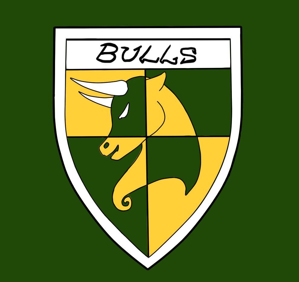
This was an initial design for our team to give ourselves jerseys and a newer more professional look. Kinda shot down the idea of putting a "C" on our captain's jersey, though. Unbalanced it too much. (Our school colors are green and gold and our mascot is the bull)
This is going to be the shield crest in the middle of our jerseys
Last semester our officers asked me to redesign our old logo:
So this is about what I came up with. For our shirts I figured this could sit on the front as a crest, breast pocket size and location.
I tried to make the crest less about quidditch (at the request of our president to be different from other teams) and more about..our school, I guess. Subtlety, in my opinion, is best. Even the snitch wings at the top were mimicking our actual school logo, a U with horns:
I figured this would be our final logo, incorporating both Quidditch and our bull in minimalist fashion. Designed to be huge on the back of our shirts. (In my head, at least)
Just some stuff I've been working on. (More like consumed with, there's at least half a sketchbook filled with design after design trying to figure out what looks best)
And these are what I believe the officers decided the shirts will look like. ^