Sunday, September 15, 2013

Pyramid Head Commission

My second commission since getting back into costuming. The customer wanted me to build her a head specifically from a video online.


 I find this picture particularly funny because my mom was like, "WHAT ARE YOU BUILDING." I told her it was some big monster dude and I needed a model real quick and she did this. My mom is 56. Dayum, look at dem arms.


I should have taken more pics of the back. >_<

Some work over the past year or so

So I haven't been totally off grid. I've been getting work done with my BA in studio arts. I took pictures of some of the work I've been doing.

 This was a Rapidash sculpture I was doing in ceramics in Fall 2012. Partially finished with supports
 His rearing legs.
This assignment in Int Drawing in Fall 2012 was just about trees, i found a picture of a japanese blood maple and painted it with sticks and leaves lol


Rapidash finished with glaze

 Closer view. He looked slightly ponyish..

 A project I did to better our uniforms for USF Quidditch. I saw that Kat Young from Australia had done an awesome cartoon version of some players to advertise uniforms, so I was inspired. Used members from my team as reference.
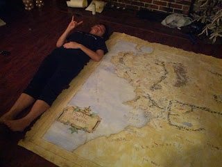
 This was a mapping assignment for int drawing in the fall as well. I love cartography, so yeah....I've always wanted to do this...Quill and ink.


 It ended up being about 5.6 ft by 6 ft I think.
 More logos I had done/thrown together for Quidditch.


Some edited details with the company, but here was their about final mockup of my designs.

Friday, August 17, 2012

More Updated USF Quidditch designs

So all I've really done this summer is work on stuff for my Quidditch team, USF Quidditch. Again. Once I take pictures of some of my traditional artwork I'll post em. No costuming yet, sigh.

 So this was my fav design with the IQA logo instead, we just figured the league's logo would be better.

 So I believe this is the "final" jersey, front and back. Clients (as well as myself) wanted it to flow better from front to back. Luckily all I did was watch the Olympics the entire time it was on. So TONS of ideas. I mixed a lot of field sports and eventually came up with this near the end. I'm actually really happy with it.

 Ah yes, this is again, our back logo for the fan shirts. We can't use the U anymore, so instead I cleverly hid it inside some snitch filigree.
 Heavily inspired by the South African runners shorts in the Olympics. Oscar Pistorius, ftw!! Runners tend to use stickers to tape their numbers on their shorts, so I thought it might be cool if we instead printed them on, since sports like football, volleyball, field hockey, etc.
Here's a full uniform. I liked it.

Tuesday, June 26, 2012

USF Quidditch stuff

I've been dying to post these somewhere since I mostly finished the concepts in late May, but our team (USF Quidditch) is hopefully going for the fully custom jersey look. Some of the things are imperfect, like the colors on the shield should match the vegas gold of the jerseys, but by that point, TOO LAZY. A friend helped a lot, she  had to teach me how to use a tablet. Digital art=not my forte. Our team is an official sports club though, so we actually get to use the U!!

This is my favorite, with the swoop. I know it's asymmetrical, but I actually like that a lot. Plus the little shoulder crest is completely original. Takes ideas from our other crests at school, but we will be the only ones to have this. :D 

 One I did as a joke. Makes me think of Mandalore the Ultimate's mask. For some reason our Captain liked this one.
 Not my fav, but were I to add a third fiery line thing i think it would look alright.
 This is basically what our magazine ordered jerseys from the past year look like as of now.
 Looks a bit like the side of Boba Fett's helmet, WHOOPS
 Our President asked me to redesign our logo that goes on the back of our tshirts. I actually like this a lot.
 Captain's badge I did as a joke. Our third school color is actually purple, for some reason.
 Only thing that changed is actually writing "Quidditch." Something that was suggested last year in a rather..annoying way. I was too burnt out to see they were right though. Oh well. Times, they are a changin'.
 Close up of our crest. Never would have guessed this was done from scratch, rather than stealing it from the internet.
I recognize the H is off. A teammate suggested that he really wanted our jerseys to say somewhere that we play Quidditch. He also said our Bulls jersey crest should stay on the right, over the heart. "Where it should be." I liked that, so to balance it out I figured this would go on the other side. Considering our official athletics font isn't available anywhere, and I had to do this from scratch too....I'm proud of it.

Monday, March 26, 2012

Some finished art this semester

Here's some of the stuff I've done come to pass a bit...


From last Halloween. Myself in my Spartan armour, a friend in my Ezio costume.

The costume actually looked pretty decent on him, since he is an actual guy and all, compared to me as a girl in it.
 Since me and my friend were always the starting beaters on our team, someone made this funny comment so we made it into a motivational poster. A bit fitting. Plus I like this picture.


Also my team in the jerseys I designed at Quidditch World Cup V in November, in New York. We placed 7th of the 97 teams there.